|
Cornell Tech's Data Hackathon presented the challenge to develop socially impactful data science products. I joined the team from Cornell University and decided to make a tool that can let people know the profitability of installing the solar panel at a particular place. We ended up using three sources of data: 1. NASA API for values on solar intensity at a particular latitude and longitude 2. Google Map API for retrieving satellite images 3. US Government's data on solar panel installation costs We used K-Means clustering to find the area of roof at a particular latitude and longitude. Here are the slides that we pitched : http://www.slideshare.net/ams345/1-solar-map Below is the screenshot of our main finding. We were able to find out the values of profitability across US and present it visually. Lighter color means lesser profits. 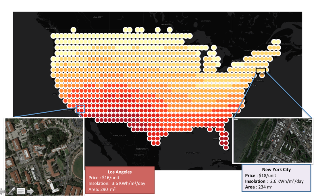
0 Comments
Leave a Reply. |
