|
12/8/2015 0 Comments Content ChannelAfter developing the backend of machine learning algorithm I am working on ways to present the results to the users so that it can be easily understood and adapted. The demo site will be up soon but before that I thought I can display it here with some screenshot of how is it going to look like. There are many parts to it. 1. Each vertical (like Health, Automotive, etc.) is a model that was trained using supervised learning models. Model selection was done using grid search. 2. Front end demo is designed to show how the end user (here ad agencies) can interact with visual elements. Inventory: Expected number of times there will be an ad serving opportunity in next 7 days (approx. 13 million here) Inventory Relevance: Each web page is softly categorized into three categories where hard relevance means high relevance and no relevance means that a webpage is not relevant to vertical. So an Automotive article will be placed under no relevance category under considering Health vertical. Idea stems from the concept that an article is a mixture of topics. For instance, an article on 'An apple a day keeps doctor away' is actually about Health but it also has component related to Food. Thus, it will be slightly relevant to Food while highly relevant to Health. Visual Elements: Bar chart on the right represents inventory percentages in each relevance category with respect to Health vertical (because that is clicked here). Calculator: On the right I have shown a calculator where the user can slide the slider to get total count of the inventory under desired categories. WordCloud: What are the words abundant in the category of that vertical. Shown below is the word cloud for Health articles under Hard Relevance. 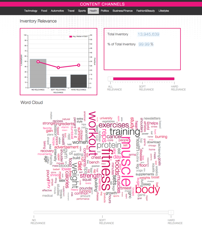
0 Comments
Leave a Reply. |
